
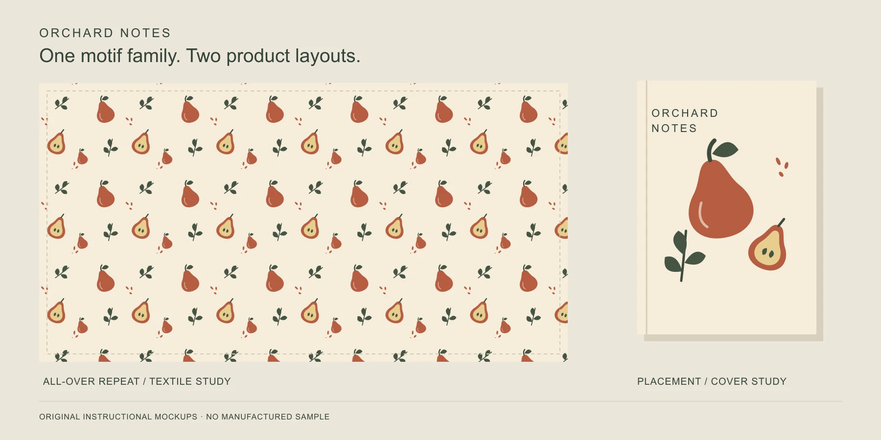
Surface pattern design is the creation of artwork for product surfaces, including fabric, wallpaper, stationery, packaging, and homewares. Repeating patterns are a major part of the work. Designers also make artwork positioned for a particular product, such as a notebook cover or the border of a tea towel.
That broader definition matters when you start learning. In her explanation of surface pattern design, practicing designer Elizabeth Silver describes work that includes both repeats and engineered designs. A useful starting goal is to make artwork that suits a specific object and explain how it should be reproduced.
This guide follows Orchard Notes, an original, self-initiated practice project using pears and leaves. All illustrations are instructional diagrams or flat product mockups created for this article. They show proposed design decisions, not manufactured samples or client work.
What does a surface pattern designer make?
A designer develops motifs, compositions, colorways, and production artwork for an intended surface. A motif is an individual element, such as a pear, leaf, or geometric shape. A colorway is an alternative palette applied to the design. The finished work might be a repeat tile, a positioned illustration, or a coordinated group of designs.
The application changes the decisions. Wallpaper is viewed across a room and across adjoining panels. A notebook needs a readable composition on one bounded cover. Fabric may be cut, folded, or gathered, so a beautiful flat swatch can behave differently after construction.
| Application | Design question to answer early |
|---|---|
| Apparel fabric | Does the design have a clear top, and must pattern pieces follow it? |
| Wallpaper | What scale works on the wall, and how should neighboring panels align? |
| Stationery and packaging | Where are folds, trim lines, text, and important visible areas? |
| Home textiles | Which motifs remain visible when the product is folded or sewn? |
Repeating artwork and placement artwork
A repeat extends across an area through a defined repetition rule. The tile must join correctly, and the larger composition must avoid unwanted stripes, gaps, or clusters. Straight, half-drop, and brick arrangements are different repetition rules; the intended rule belongs in the handoff.
Placement artwork is composed for a defined location or panel. Engineered artwork is designed around particular product dimensions or construction, such as a garment border. These terms overlap in professional use. A border can repeat along its length while remaining precisely positioned relative to a hem.
For Orchard Notes, the tea towel gets an all-over repeat. The notebook gets a single pear arrangement positioned on its front cover. Tiling that notebook illustration would add unwanted copies; centering one tile on the towel would leave most of its surface empty.
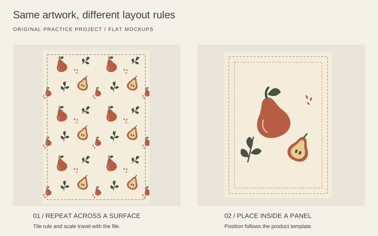
Original instructional mockups. Dashed boundaries explain layout; they are not part of the artwork or a supplier-approved cutting template.
Surface pattern design and textile design
The fields overlap through printed textiles. Surface pattern work also includes paper, ceramics, and other materials. Textile design can involve how the fabric itself is made, including knit and weave structures. For example, UAL's Textile Design course covers print, knit, and weave as distinct pathways.
Drawing a repeating pear design does not establish a weave structure or specify a fabric's performance. Those tasks require additional material and manufacturing knowledge.
Start with a brief you can actually finish
Before drawing a collection, define one product and one deliverable. For practice, add a second application only when it helps you test a different decision.
Our original practice brief is deliberately small.
| Brief item | Orchard Notes decision |
|---|---|
| Products | A 45 × 65 cm finished tea towel mockup and an A5 notebook front |
| Visual direction | Quiet kitchen imagery with open spacing and hand-shaped silhouettes |
| Motifs | Whole pear, cut pear, leafy stem, and small seed marks |
| Palette | Warm paper, rust, and dark olive; one alternate colorway |
| Layouts | Straight repeat for the towel; positioned composition for the notebook |
| Deliverables | Editable master, repeat tile, cover artwork, and labeled previews |
These dimensions belong to this exercise. The towel's finished size does not specify its cutting panel or hem allowance. A real notebook requires the manufacturer's cover template, including spine and back if applicable. Ask for those details before treating either mockup as production artwork.
Develop motifs with a useful range
Make a small family of related elements. In Orchard Notes, the whole pear gives the pattern its main silhouette, the cut pear adds internal detail, and the leaves change the direction of the composition. Seed marks fill selected gaps without introducing another subject.
Keep the elements separately editable while arranging them. Remove accidental scan backgrounds and inspect fine details at the intended physical size. A delicate line that looks attractive at 400% zoom may disappear on the chosen material.
Choose the working format around the artwork. Vectors make flat shapes easy to recolor and resize. Raster artwork preserves painted or photographic detail, with enlargement limited by its pixel dimensions. A vector file can still contain embedded raster images, so check the contents rather than relying on the filename.
Avoid polishing twenty nearly identical motifs before testing any of them. One trial composition will reveal whether the design needs a wider leaf, a smaller pear, or more open space.
Build the repeat, then judge the whole surface
Place the main motifs first, vary their relationships, and add fillers sparingly. For Orchard Notes, the open spacing should remain visible after repetition. If every gap contains a seed mark, the original brief has already changed.
Use the step-by-step seamless pattern tutorial for the edge-matching geometry. Here, the important design check comes after the joins work. Inspect a large repeat view for recurring dark bands, obvious diagonal tracks, awkward tangencies, and conspicuous empty patches.
The example mixes motif angles to reduce a strong upright direction. That choice should be explicit. A directional design can suit a product well, but the person cutting fabric needs to know which way is up.
Keep the notebook composition separate. Use the same motif family, then arrange it within the cover's visible area. Place essential artwork away from trim uncertainty and any area reserved for lettering. Do not include a fake barcode, publisher identity, or other invented commercial detail to make the mockup look commissioned.
Export your straight-repeat tile and inspect its joins and spacing before choosing a product scale.
Test scale and colorways as product decisions
Scale has a physical meaning. A 2400 × 2400 px repeat represents an 8-inch tile at 300 pixels per inch, or a 16-inch tile at 150 pixels per inch. Changing the resolution metadata alone adds no detail. Confirm both the pixel dimensions and the intended print dimensions.
For this exercise, compare 8 cm and 12 cm repeat widths on the same towel area. At 8 cm, more pears appear across the surface. At 12 cm, each pear becomes more prominent. Print a portion at actual size before choosing; a resized screenshot cannot establish either scale.
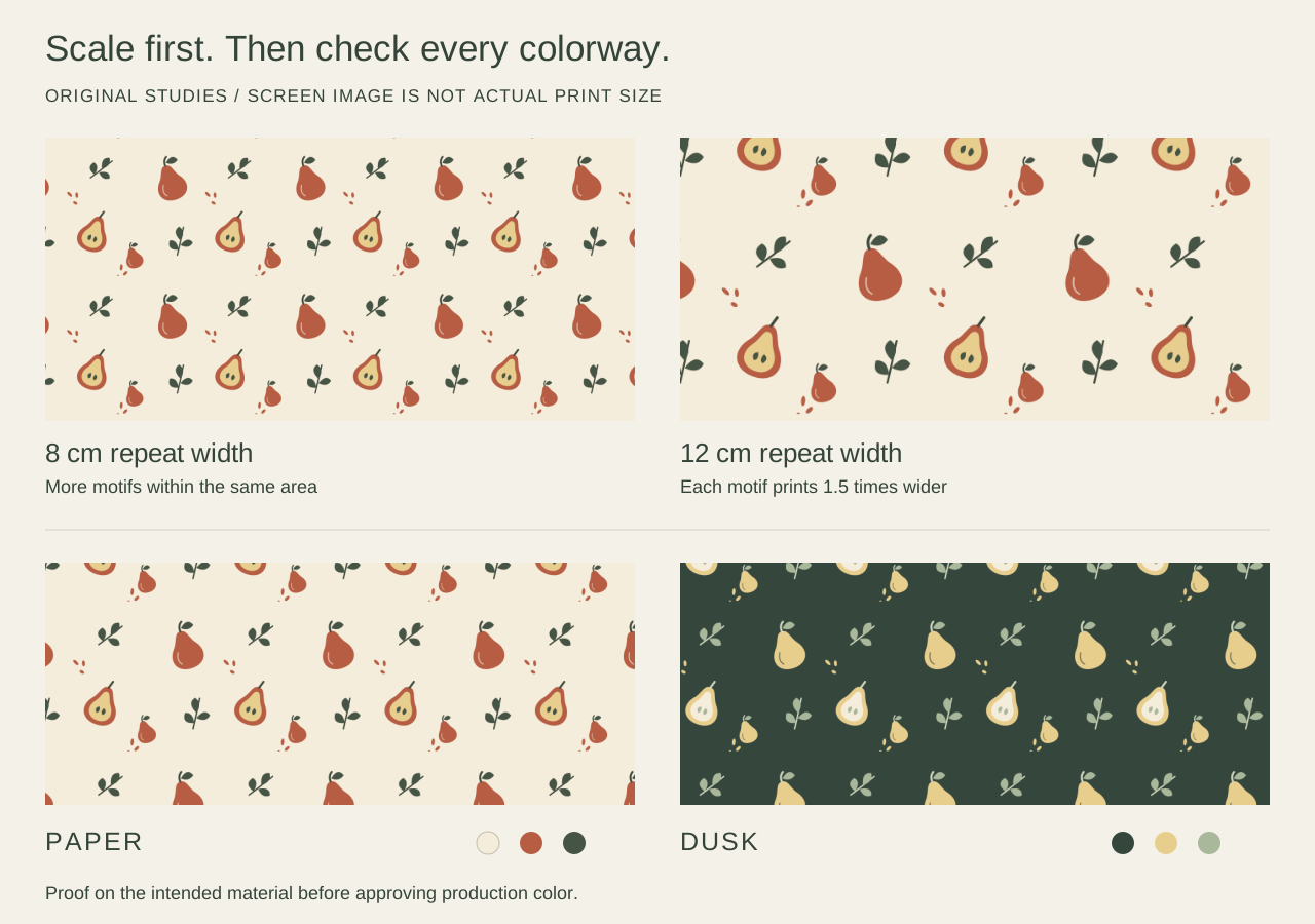
Original scale and palette studies. The two upper windows represent equal physical areas; the illustration on your screen is not a life-size print.
Recolor by function. The main silhouette, fine details, and background need enough separation in each colorway. Orchard Notes' Dusk version uses a dark background and light pears; the leaves also change so they remain distinguishable. Simply inverting all colors would not resolve those relationships thoughtfully.
A screen preview cannot approve printed color. Request a proof on the actual substrate through the intended printing process. Check the background, smallest details, and the relationship between adjacent colors. A material or process change can require another proof.
Match the tool to the work remaining
For artwork built from separate motifs, keep using your drawing or layout editor to adjust individual elements. Craft Industry Alliance's introductory guide describes the progression from original motifs into digital pattern work and emphasizes composition, color, scale, and orientation alongside software skills.
If you already have a flattened illustration whose edges fail when repeated, SeamlessCanvas's existing-image workflow addresses that different problem. Its paid core repairs seams while aiming to preserve the uploaded raster artwork. It does not recover layers, create editable vectors, or make individual pears independently movable. Review the repaired image for changes before using it.
Use a working copy of your flattened artwork, then compare the repaired edges with your original.
Use the Seamless Pattern Checker to inspect the exported tile in repetition. After choosing its scale, Pattern Filler can extend the tile into a PNG, JPG, or baseline TIFF canvas with DPI metadata. It does not produce CMYK separations or guarantee approval by every printer. Keep the editable master outside that export workflow.
Proof and hand off a design someone can reproduce
For Orchard Notes, review the towel repeat and notebook placement as separate deliverables. Reopen the actual exported files. Check for transparent padding, unexpected backgrounds, missing elements, and a resolution change during export. Verify the notebook against its template, not against the attractive presentation mockup.
Printer requirements differ. As one concrete example, Spoonflower's upload requirements specify JPG or PNG, sRGB, the preferred print dimensions at 150 dpi, and a file under 40 MB; they exclude TIF. That is a platform-specific specification, not a rule for all surface design.
Include these items in a practical handoff.
- Artwork identity with project name, version, date, and approved colorway.
- Repeat specification with tile width and height, physical scale, repeat rule, and direction.
- Placement specification with the current supplier template, trim and bleed requirements, and safe areas.
- Files with agreed formats, pixel dimensions, color profile, and a clearly identified editable master if included in scope.
- Proof record identifying substrate, process, approved sample, and any remaining approval.
- Usage agreement covering permitted products, territory, duration, exclusivity, and responsibility for later adaptations.
Use a filename such as orchard-notes_repeat_paper_8cm_v03.png and send a matching labeled preview. This makes a later request to change scale or colorway much easier to trace.
With the repeat scale agreed, fill a canvas at the required dimensions and review the exported file before supplier proofing.
Learning the work and building a portfolio
Surface pattern designers may work in-house, take freelance commissions, license artwork, or sell their own products. These arrangements involve different responsibilities. A commission can require revisions and a defined handoff; licensing requires agreed usage; selling products adds sampling, fulfillment, and customer service.
A beginner portfolio benefits from finished, clearly labeled practice projects. Show the motif family, a repeat view, a physical scale, and a credible product application. Explain one decision and one revision. Keep self-initiated mockups labeled as such, and never describe a fictional brief as a real collaboration.
Use artwork you created or have permission to use for the intended purpose. Keep stock licenses and source records, including restrictions on resale, templates, and print-on-demand use. The U.S. Copyright Office's visual art overview explains the role of permission when using someone else's artwork. Seam repair and recoloring do not establish that permission.
For your first project, finish the towel repeat and one placement design before expanding into a large collection. A reviewable file, a documented scale, and a proofing plan give you something concrete to improve.